Based on the feedback we received it is essential to improve the camera movements as it is seemed as one of the distractions. Stop Frame Animation is about a smooth change of the objects and fluent moves, so that it seems realistic. We didn't manage to keep the camera stable at some parts of our film, however this would be our main aspect when creating another video based on this concept.
I believe that overall, we managed to create a beautiful stop frame animation and we presented it in an interesting way. The soundtrack was the right choice as it appears from our feedback and personally I believe it worked well as it perfectly describes the importance of Time.
The background might be slightly distracting, however we wanted to make a comparison which would suggest reality and how people make changes in their lives, what contrasts with the action in the video.
I am happy with the result of the video and received feedback as it shows that the film is quite successful overall.
Feedback from the audience and our response....
To gather
feedback from the audience, we uploaded our completed stop frame animation onto
YouTube and Facebook. Also, the clip was shown to individual people.
YouTube Feedback

On YouTube, most of the feedback
was positive with few comments on how we could improve the video. We also
had a chance to respond to the feedback, what showed interest in the
video.
We
received a suggestion that the video could be slightly longer, however timing
was one of our limitations, therefore we couldn't make it as long as we wished
to.
"Good
idea, although the camera doesn't appear stable in few moments.",
I definitely agree with this observation as at some point it was
difficult to keep the camera stable. Some movements of the camera required the
use without tripod; therefore some parts weren't very clear. To improve this, I
believe we could spend more time to create slow and constant movements to keep
it stable and carefully consider the moves of the camera.
Based on
the audience feedback, I believe that the choice of music and the way we used
it worked really well. Also, the idea of our understanding and representation
of time as well as the typography was considered as successful.
Facebook Feedback
On
Facebook, we also received mainly positive opinions about the video. It
was described as creative and it showed experimentation.
"Very fabulous work overall, the only thing I could mention is that at some parts, the camera seems to be way too shaky, especially at the but it focuses on the arm and sort of pans around it at 0:39s, so if you could slightly improve the flow of those frame transitions it be absolutely perfect"
Again, the instability of the camera in being mentioned, therefore in another video, the movement of the camera would be the main concern for us.It would be useful for us to practice 'pulling' and 'zooming' to get the right.
Feedback from individual people
Feedback
from individual people contains positive feedback as well as negative.
"Lighting
and set was very well considered-The lighting had soft effect that
was appropriate for the feel of the animation and the
soundtrack"
We
focused on the lighting a lot, so that it creates the
right atmosphere and draw viewer's attention to the main
character. The lamp we chose provided the soft glow.
"Not
sure about the newspaper background-what was a significance of it-some of the
newspaper text was a little distracting"
I tend to
agree on this comment at some point, as the background could be found
distracting, however our point was to make a symbol of reality and description
of what's happening in the world represented by the newspapers, while the main character stays without
changes.
"Panning
out to show both legs was a good idea and worked well"
We tried
to make the composition run fluently, however we didn't want to make it so
simple, therefore we continued the pattern on the visible areas of the
body. The panning in was successful as it seemed easier as we concentrated on this subject matter in the camera viewfinder.
"The
following pan -it didn't work so well as it was not so fluent"
Again, we
experienced difficulties with keeping the camera stable as our experiment
required a lot of movement. It was much harder to maintain focus on the subject when panning out.
"Animation
too jerky on the arms"
I tend to
agree with this opinion as some parts of the pattern didn't work very well.
Especially, in that particular point, the camera was slightly out of focus,
however our point was to make the pattern slightly terrifying so it describes the
story. We should have re-shot this part and taken more care with depth of field.
"Continuity
not correct on close up of the hand on guitar fretboard"
Keeping
the camera stable, creating pattern on the body and making a movement of the
camera was a very challenging task. It didn't work as well as expected, but it
gives an idea of what we tried to interpret. Again, as we would want to improve
the video, the movement of the camera is one of our main aspects.
"Why
did you choose to do a portrait orientated film?"
One of
our limitations was the space we could use when taking photographs, therefore
we avoided having unwanted objects in the camera by choosing a portrait
orientation. Also we needed to concentrate on vertical movement, this meant that the portrait format was appropriate.
"Overall
well paced-the movement of the plant/leaves up the body was innovative-I think
a good starting point for further work"
"Soundtrack
choice was a spot on-very appropriate for the pace the and movement in the
animation"
We spend
a lot of time on thinking and researching the soundtrack, however I also
believe the combination works well.
"Typeface
used in credits was excellent-it matched the organic flavour of the paintings
on the body"
We wanted
to keep similar quality of the typography to the film itself creating it
manually.
The letters were created using a fine liner pen and each part of the letter was gradually added as the photographs were taken. It took a lot of time to produce that particular part of the film as the whole process had to be done carefully so that the video is fluent.
The Final Project
Looking at our previous experiments, I started to think what went well, what didn't and what we could do to improve that.
In our last experiment, the idea of the background worked well as it looked exciting and fascinating. Through that concept, we wanted to describe what our video is about.
The lighting in our last video wasn't considered well enough, what caused an unsuccessful outcome at the end, however we did focus the lighting on the main character what gave a fantastic result and helped the audience concentrate on the subject instead of the busy background.
In this process of creating the video, we had limitations like space and the lighting wasn't as strong as in our previous video.
Our concept of the video is to describe the attitude of a young person towards life and to show our own interpretation of time.
A person on the chair is our main character, whose life is passing by what starts to appear on her skin. It seems like her she is trying to go against the time, however she is not making any changes which could positively reflect on her life. The background made out of newspaper is slightly distracting, however we wanted to make a symbol of reality and people making changes in their lives, while our character is sitting calmly and still, without feeling or emotions what symbolizes no changes.
The guitar is supposed to represent undiscovered passions and talents, which cannot be used without any changes.
By this idea, we wanted to describe the importance of Time and what role it makes in everybody's life. We try to communicate with the viewer and make the audience think about our concept more in depth.
I believe that the outcome is quite successful and I really like the concept and the music which perfectly describes the importance of Time, although I think we could improve the project by keeping the camera more stable and maybe making the project slightly longer.
For the titles, I also used the stop frame animation technique, what took quiet a lot of time to complete, however I'm happy with the result as it is.
What I'm very satisfied with is the lighting, because it was one of our limitations. And we managed to deal with that using a normal desk lamp and we put it on the ground what created an interesting effect.
When editing, we used the fade in and fade out effects to make the video run more smoothly and it worked quiet well. Also, at the beginning of the video, we decided to show the whole character and start getting closer to a certain part of the subject, which takes up the whole frame.
How to write a Film Treatment?
Looking at different websites gave me an idea of how to start of when writing a film treatment.
http://www.lightsfilmschool.com/articles/treatments/index.html
This website generally describes what treatment is about, how long it should be and it explain what it is for.
http://www.beatsheetcentral.com/
This website is created by a screenwriter and a director, who explains the importance of the process which describes the movie or TV episode.
Treatment
The Time
Stop motion
is about creating something unusual or abstract in a realistic way to achieve a
fascinating, exciting and appealing result. Our project is about a
representation of stop motion and our own interpretation of Time. The idea of
our short animated film is to present the movement of natural objects with the
use of art. It’s also to show exploration and development in media of stop
frame animation. It was later in the experimentation that we wanted to include
the human figure.The duration
of it will be 1 minute and 10 seconds and in that amount of time we will give
across an idea of an importance of the Time and show how quickly it passes by.Our photographs showing a continuous pattern which increasingly appears on the human body show the changes that occur in people’s life and it’s also a different way of representing a journey that each person needs to go through and that journey is ‘drawn’ on our skin.The whole animation will start from the title, ‘The Time’, which appears as stop motion, followed by the image of a person sitting on a chair with a guitar. The guitar would represent the unfounded passions and talents.
I believe that our animation could be used as a music video with a strong message, which we try to communicate with viewer and make the audience think of the video more in depth. The calm and still person symbolizes no feelings or emotions through life without making any changes, while the Time keeps on going on and it seems like it passes by without the character being involved in life.Our aim is to create quite sad and dispiriting emotions through the video.
‘The Time’ by Hans Zimmer is a powerful melody, where at some point it seems frightening, but it creates the right atmosphere. We want show the feelings of a young person, who has undiscovered talents, but is too sad and depressed to find out those talents and make a use of them, so the Time passes by making inconvertible changes, while the person stays the same.
The technology used for making the animation was an SLR camera, tripod, camera Lighting and a computer were we used the software’s Windows Live Movie Maker and Final Cut Pro and the target audience for ‘The Time’ is the Raindance Film Festival, MTV, KISS, The Box, 4Music, etc.
Our Storyboard

We created a storyboard based on our idea. It will represent a person sitting down still and holding a guitar while the camera will show the pattern 'growing' on the girl's leg and going up through the whole body describing the process of time passing by and the effect it makes on people.
As our background we decided to have newspapers, so that it's not plain and hopefully it won't distract the audience from the main subject.
The name of our project will be called 'The Time' and we will be able to show our own interpretation of time of a young person.

Hans Zimmer and his music
I have looked at different kinds of music more in depth and
they didn’t necessarily include the sound of the guitar, however I thought that
they could work well as long as the soundtrack matches the actual video.
I found an amazing composer and music producer who creates a
very powerful melody. Zimmer’s works are notable for combining electronic music
sounds with traditional orchestra.
Gladiator (2001)
Golden Globe Awards, Satellite Award, BFCA Awards
Inception (2011)
Satellite Award, Saturn Award, WAFCA Awards and World Soundtrack Awards
THE TIME
All of those soundtracks have a beautiful sound, and I believe once the video is produced, it will be possible to choose the right music.
Music choice
By looking at different experiments, I found out how the sound or music choice is important. It describes the whole film and it can manipulate and create different feelings and emotions depending on the sound.
Firstly, I thought of the meaning of our video. We want to represent 'Time' as a subject that isn't appreciated until its too late. The idea of drawing on a human body is supposed to create images of growing trees, people getting older and how it is possible to recognise it on their skin. The short animation is also supposed to represent change and it is one of the things that go along with time.
I thought of using a sound which will include a guitar tone as we used a guitar in our experiments and we plan to use it in our final to represent change while the drawings will represent time and change.
Music examples I have looked at and analysed to see whether they will work with our animation.
Ronald Jenkees - Guitar Sound
I think the sound is quiet interesting and I find it quiet relaxing, however I think we might need something more delicate.
Chopin - Nocturne Op. 9 No. 2
This sound represents Chopin's music played on the guitar. I think it's a beautiful sound, however it might be slightly slow for our animation. Also, it seems to be quiet happy and our video is about something else, therefore I'm not satisfied with this particular choice.
Phil Boroff
Another example of music with a use of classical guitar. Again, this time I believe that the song doesn't reflect what we will try to represent through our video.
Aldo
In my opinion this is a very calm and relaxing guitar music. However it's not very powerful and to represent the idea we want to show.
Painted Animation
 I looked at different styles of creating stop motion animation which included drawings. Another project is represented on the public walls. Creative, impressive and ambitious project is quite abstract and interesting. I really like the randomness and the abstraction works really well with the location, however I think the animation is definitely too long and slightly scary and creepy. The whole video is very random. It doesn't have a specific story. I believe it would be more successful, if the producers have had a plot, which would have a meaning instead of painting a lot purposeless objects and characters which convert from one to another. However, I really like the chosen sound, which perfectly reflex the action represented on the walls and the ground. Also, the combination of mixing the abstract part of the film and the reality is quite fascinating as the people that appear in the animation seem like they don't notice the abstract world around them. This video helped me consider the sound more as it is also an important part of the film. The music or sound shouldn't only represent the sounds which would happen in reality, but it should also describe what is happening in the animation and create appropriate feelings and emotions.
Whiteboard Animation
For further inspiration when producing the final project, I have looked at different videos which included drawings. Looking at other people's work and their styles is very helpful to get a good idea of what we want to do for our final video.
One of the stop frame animation motion animation, which included mainly drawings within. The video is quite interesting as there are different objects drawn and they change quite fast, however I think the video is slightly to long, because it lasts for over 4 minutes. The animation doesn't really have a specific story. It's mainly random objects drawn which develop and change from one to another to keep the animation affective and exciting. What I particularly like about this animation is the fact that we can see the hands actually creating and drawing the objects. This action makes it more realistic and its not just plain whiteboard animation. Even though, we are not able to use the whiteboard or a paper in our project as stop frame animation requires 3D objects included, therefore we can only use this style for some part of our animation.
One of the stop frame animation motion animation, which included mainly drawings within. The video is quite interesting as there are different objects drawn and they change quite fast, however I think the video is slightly to long, because it lasts for over 4 minutes. The animation doesn't really have a specific story. It's mainly random objects drawn which develop and change from one to another to keep the animation affective and exciting. What I particularly like about this animation is the fact that we can see the hands actually creating and drawing the objects. This action makes it more realistic and its not just plain whiteboard animation. Even though, we are not able to use the whiteboard or a paper in our project as stop frame animation requires 3D objects included, therefore we can only use this style for some part of our animation.
Another whiteboard animation example is a Carphone Warehouse advert, which I didn't find as successful as the previous experiment. I think that the lighting wasn't considered very well, as the background lightness changes. I found it interesting at first, because it wasn't just plain white background and it gave the audience an idea of timing. Unfortunately, the lighting was changing very randomly what shows that it wasn't considered at all. Again, I like the idea of including human hands in the video, it suggests a clear idea of what carphone warehouse offers to its customers. The whole advert is really quick and simple. What I didn't like about the animation are the exaggerated objects and characters drawn, what might create an idea of abstraction.
Influences and Inspirations...
Knowing that I'll will use drawing technique in our final project, I've looked a animations which include this style of creating stop motion. I found a very interesting animation which is based on a 'Matrix' film, representing a travelling bullet. Part of it was created digitally, but that keeps the video very realistic and interesting. I really like the way the audience sees the journey of the bullet from different angles, so that it is easy to understand. Also, the drawings are very detailed, but clear at the same time what makes an amazing combination.

I find this animation very influential and helpful when considering the use of this or similar technique in our project. I really like the fact that the actual camera stays at the same place taking picture of what's actually going on on the paper and with the use of pencil tells us the story and the purpose of it.
It was inspired by the 'Matrix' film, however while watching this video I thought of the music video of 'Take On Me' by A-Ha.
'Take On Me' made the biggest impression on me, because it was the mixture of reality and pencil sketch animation, which was actually really realistic, interesting and very successful. The music video was directed by Steve Barron, who is mainly a music video director and producer. The music video was recorded in 1984 and released in 1985. Rotoscoping technique was used to create the animation. It is basically a technique in which animators trace over live-action scene film movement frame by frame to produce a stop motion. The images were after redrawn by the animator. About 3,000 frames were rotoscoped and this action took 16 weeks to complete. The theme of the video is a romantic fantasy. Overall I think the whole music video is really successful and unique.
Ladyslaw Strarewicz
I have been researching for other inspiration to include it my final project. I looked at an animator, who was born in 1892 and he created animations like ‘The Beautiful Lukanida’ in 1910, ‘The Battle of the Stag Beetles’ also in 1910, then ‘The Ant and the Grasshopper’ in 1911, ‘Voyage to the Moon’, ‘On the Warsaw Highway’, ‘Frogland’ and many, many others. Starewicz was the first filmmaker to use stop frame animation and puppets to tell consistently understandable stories. His animations often included insects’ bodies what made the video more interesting. His works usually are about 7-15 minutes long and they have a certain story. The scenes are created to look realistically, however the characters are usually abstract. The colours of the projects are very simple, mainly because of the quality of the equipment Starewicz used to produce the stop motion animation, which wasn’t very good at that time. In his works, the abstract characters don’t speak. Instead, the animator put the piano music which will go with the clip to create mood and atmosphere and to make it easier to understand.
I didn't find his work very helpful to produce our final project. The only part that might be a little but helpful is the way Starewicz used music to describe what is happening in the animation.
Tim Burton
I looked at different stop frane animation artists and I found Tim Burton as a very inspiring person, who is an American director and film producer. He is well known for creating animation like ‘The Nightmare Before Christmas’ and ‘Vincent’ where he used the stop frame animation through the whole video. However, he also produced movies like ‘Sleepy Hollow or ‘Charlie and the Chocolate Factory’, where he often worked with Johnny Depp. Burton’s style is usually very dark, dramatic, scary, where the shapes of the object are usually very exaggerated. I thought that looking at his stule might be helpful when producing our final project, because he created gothic style animation being influenced by art nouveau. However most of his film are either dark or colourful, but sometimes contain both including extremely dark atmosphere in buildings and set design.
Vincent
 In this stop frame animation Tim Burton created very dark, scary and exaggerated curved shapes with sharp edges. The use of black and white makes the animation even more successful .
In Alice in Wonderland, Tim Burton shows a combination of dark colours and colourful background with the same Gothic style with many abstract shapes. Those factors make the film unique and interesting.


The Nightmare Before Christmas
The style of this animation is very similar to 'Vincent' animation, because of the use of lines, shapes and shadows, however the use of the colours is more similar to 'Alice in Wonderland'.


I found Tim Burton's style very interesting, unique and influential , therefore I wanted to use a similar technique in our video. However, I wanted over final project to be more optimistic and positive, so I would rather use warmer colours. What I really liked about his work is the use of shapes and way he makes the lines curved to make the film successful.
Alexander Petrov
 I looked at the examples of artists’ work that used drawing, or painting techniques to create stop frame animation. One of the most interesting artists I found was Aleksander Petrov, who was a Russian animator and animation director. He mainly creates short video clips, which are entirely made in pastel oil paintings on glass, what is very impressive. Instead of a paintbrush, he used his fingertips on different glass sheets which he covered with slow drying oil paints, what gave him an ability to add depth into his work. Petrov usually painted on A2 canvas, so that every time he photographed the frame, he changed the image slightly for the next frame to create an illusion of movement when the photographs are running in a sequence. The technique Petrov uses a very creative, time consuming, beautiful and successful. His works include people, animals, landscapes which are painted very realistically. When making detailed paintings, the artist had to think of every movement very carefully. He also created different scenes and angles to make the video more realistic and so that the audience is able to easily understand what’s happening in the clip. I found work of Alexander Petrov very interesting and helpful as my project also inludes the creative part, where we had to create drawings when producing the stop frame.


The Process of a Final Idea
For our project development, we started creating out final video, by taking photographs. We created a studio, were we had much bigger space to work. By looking at our first experiment, we thought that the idea of the newspapers worked well, so we decided to use them as a background again. For the lighting, we used a much bigger and more powerful source of light, so that the audience is focused on the character and so that all the details are visible.


I put few pictures of how we were creating the background. I also wanted to show the light, which we used for the project and how did the whole set looked overall. With the newspapers, we decided to go more spontaneous, what looks quite interesting, but in my opinion it also distracts the viewers' attention from the main subject.


Our final photographs weren't as successful as we expected, because even though, we considered the space of the set, the lighting etc. there were other things that didn't work. One of our ideas, was to draw on the body with henna, so that the actual drawings will be more visible and bold. Unfortunately, we had to stick with a pen at the end.
We had limited time to take photographs, so to save time we used two people to draw on the body. This action gave two different styles of drawing at the end. Also, people creating the drawings produced shadows so when the video is played, the lighting keeps changing very quickly.
Some photographs were taken out of focus, so again, this part didn't really work.
When we start taking photographs for another video, we will use only one person to draw on the body, and we will make sure that the lighting is not distracted, so it keeps the same.
The Process of a Final Idea
As our final idea, I came up with a new concept, which includes body drawing. I produced a very short clip of how I see the video. The purpose of the video would be to explore stop frame animation more in depth, by creating a video which will reflect the idea of it.
To create my experiment, I thought of the background firstly. Instead of having a plain one, I decided to use newspapers to make it more interesting without loosing the viewers' attention by placing the light on the right side and turning it directly towards the character.
On this video, I wanted to experiment with different objects, so that there is more than one subject. Another reason for placing a guitar in the set, is to show the difference between a subject where there is a movement and a subject which stays the same through the whole clip.
The set for the video is very simplified, as I was doing it at home, so there was limited space that I could use and I didn't have any strong and direct light. However, I think that as an experiment, the outcome is quite pleasing.
The Process of a Final Idea
By looking at all experiments we created, we decided that we're going to use a completely different technique from what we have used before. Firstly, we thought of using a human hand, which would be the character. However, as we were going along with the idea, we didn't like the outcome of it, so we started to think of another, different concept to create our stop frame animation.
Then I thought that we could use the body, instead of a hand and make it interesting and creative. We looked at different video clips which show body painting in a stop motion.
Then I thought that we could use the body, instead of a hand and make it interesting and creative. We looked at different video clips which show body painting in a stop motion.
This video is a great example of something we want to create. It involves body painting, which actually runs very smoothly and it is a quite successful video. It represents a woman, who's face and top part of her body is painted in different colours, shapes etc. what relates to the title of the clip, 'Identity'. It could mean that she doesn't know what her identity is and she is searching for it.
I personally think that this is a really incredible video. Everything seems to be considered really well and that includes lighting, background, colours and sound.
Another video, which is actually a music video called, 'Somebody That I Used To Know'. To create this clip, they used stop frame animation in some parts to make it more realistic. I really like how they colours are used and how art is combined together with human bodies. I was hugely inspired by this video and I wanted to use a similar style when producing our stop frame.
Storyboard
Creating a storyboard while making a film or a video is very important. They can be produced by hand drawing or digitally on the computer. This process helps organise the sequence of the clip. It was firstly developed by the Walt Disney Studio and even nowadays some film makers use this technique to get a better understanding of a certain scene.
Josh Sheppard created a site which shows his storyboard work in Feature Films and TV.
http://www.thestoryboardartist.com/Site/Home.html
His works are very interesting and creative. Images in his storyboards are mainly hand drawn which include a lot of details, they show perspective, describe what is going on in the scene and also he tells us the names of the characters. He carefully considers lighting and the camera angles and movements. These things make the storyboard very clear and easy to understand.
Another artist who creates storyboards is Ian McCaughrean. He produces most of his images digitally. They are very detailed, clear and organised illustrations, which are easily give the message.
Examples of storyboards:

.jpg)


2D Experimentation
As one of our first project, we created something very simple using a white board and a pen.
The video represents a basketball game. The clip is only 3 seconds long, as it was an experiment to see how it is going to work. We found it quite interesting, but at the same time challenging to draw the same subject every time in a certain form and shape. I think, we should have made more photographs, so that the video would run smoothly and it would be longer.
We created another very simple video, which represents a snake. Again, its a quite short video, because it only lasts for about 9 seconds, but in my opinion it is more successful than the first one, as the drawings were easier.
In both videos, we didn't consider the lighting, so it is different on every single photograph.
Snowmen Experiment
This is one of our first stop frame experiments. We used Jan Švankmajer's technique to create it, however we didn't want to use his style, because its too controversial, so we decided to turn our video into something more entertaining. We presented snowmen which were produced out of clay, just like most of the objects in Jan Švankmajer's videos. We mainly concentrated on the facial expression to that the video will be easier to understand. Overall, the idea is quite interesting, even though its simple. However, there is a lot of techniqal things we would have to improve to produce a successful video. One of them is the background. When we were taking the photographs, we took the from the wrong angle, so that unwanted objects appeared on the images. Another thing is the movement, it was quite difficult to control the movement of the snowball in the air and on some photographs, the audience can see a hand holding a hair which is attached to the clay snowball. Also, doesn't run smoothly. That's again because of the control of the movement. We never considered the lighting when producing the project and we used a sunlight, what caused changes of the amount of light.
For my stop motion experiment, I decided to use different materials to see what works well and what looks interesting. The main idea was to explore the stop motion technique more in depth and experiment with different objects to then decide what would be a good idea to use in a final video.
While preparing to create the video, I thought about the lighting and I decided to use small amount of light on the right side, so that only the objects will be visible clearly. However, I didn't really consider the objects that might reflect the light like chair or pens and pencils, etc., what made the video look untidy and not organised.
Also, in some parts of the video, I think I took too many pictures what elongated the clip and it became a little boring.
My video lasts for 57 seconds and it was created from one point of view to do not confuse the audience.
I think that the part with writing came out really well, because it looks realistic and interesting. To improve it I could make the writing more creative.
Overall, the whole experiment helped me with organising and preparing the place where I'm going to create my stop motion animation. I know that lighting is important, but also it is helpful to remember about all the objects and surrounding and how will they work with this light.
Another thing is the background. It is important to make a background which won't distract the audience from the main subject matter.
Next important thing is to remember about the amount of images taken, so that some parts of the video wont be longer/shorter than others, so the whole clip runs smoothly.
Stop Motion Video
To explore stop frame animation more in depth, I looked at different videos created by different people with different styles and ideas. I found a very interesting stop motion movie, which doesn’t really tell a story, but it shows a big variety of animation, what could help me get an idea of what kind of animation I would like to create.
In the clip, the audience can see experimentation with materials like legos, fruits, cups, glasses, drinks, vegetables, balls and many other different objects.
The main idea of the clip is to show movement, colour and change of objects. The video is very interesting and it creates a happy atmosphere. There are a lot of things happening and the images change very quickly. This may make the audience a little bit confused about what’s going on in the video.
An interesting part of the whole clip is the music which actually perfectly goes with the images and the movement.


Examples of stop motion animation
Tetris Stop Motion Animation
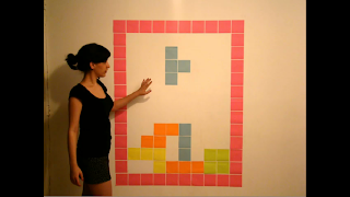

While looking at different clips of stop motion, I found a very interesting piece of work, which represents a Tetris Game. It was created using colour papers and a human in a quite big scale.
It is a 1 minute and 30 second simple video; however the outcome is very successful. The lighting was considered quite well as the shadow of the person doesn’t make the view unclear, but in my opinion, the whole video would look better if the lighting was actually stronger.
The camera stays in one position through the clip, but on the left hand side, the audience is able to see another object on the wall, what my distract from the main subject
I really like the idea of the animation, because it looks very realistic and the end of the clip becomes a little abstract where the objects start to interact with a human. Also, the sound was chosen well to make the animation more realistic.
Deadline Stop Motion Animation

Comparing to the other stop motion animation, the lighting in this clip is considered a little bit better, as all the visible objects are very clear and there are no shadows. Also, there is a lot of movement going on not just by the human, but on the wall as well. This makes the piece of work very interesting, entertaining and colourful.
The camera angles change in some parts of the clip, so that everything is clear for the audience, but most of the time, we can see a person from the back sitting behind the desk, so that the whole video is easy to understand and everything is very clear.
Everything was considered and planned well. I think that the idea for the video is really interesting. As well as the video itself is very successful.
Angle
Camera Angles, like Distances, can be used by the Director to create meaning for the audience .
Conventionally High Angles , which look down on a subject are used t make the subject look small and vulnerable, while Low Angles, looking up at the subject make it big and important.
Establishing Shot shows the whole scene and introduces the audience to location or setting.
Cutaway is a shot which shows something other than the current action.
Insert Shot shows some part of the subject detail.
Over the Shoulder Shot looks over someone's shoulder at the subject. It can be used to position the audience closer to the action or to reveal some detail.
Two Shot is a shot with two people in it.
Three Shot is a shot with three people in it
Point-of-View Shot shows the audience a view of something from the subjects perspective.
Shot-Reverse-Shot is often used in scenes with a conversation. One speaker is shot, then the camera reversed to show the other speaker.
Distance
Distance is quite simply the distance between the camera and the subject being captured.
EWS (Extreme Wide Shot)
The view is so far from the subject that he isn't even visible. Often used as an establishing shot.
VWS (Very Wide Shot)
The subject is visible (barely), but the emphasis is still on placing him in his environment.
WS (Wide Shot)
The subject takes up the full frame, or at least as much as comfortably possible.
MS (Mid Shot)
Shows some part of the subject in more detail while still giving an impression of the whole subject.
MCU (Medium Close Up)
Half way between a MS and a CU.
CU (Close Up)
A certain feature or part of the subject takes up the whole frame
ECU (Extreme Close Up)
The ECU gets right in and shows extreme detail.
ECU (Extreme Close Up)
The ECU gets right in and shows extreme detail.
Cut-In
Shows some (other) part of the subject in detail.
Shows some (other) part of the subject in detail.
Lighting
Lighting helps to convey the mood and atmosphere of the scene we are watching, The audience's attention can be focused or guided by brightly lighting an objects or person while keeping other objects or people in relative darkness.
 Sometimes it may create tension and suspense by using shadows to mask or conceal elements.
 Sometimes it may create tension and suspense by using shadows to mask or conceal elements.
Different types of lighting:
The Key Light is the brightest and the most influential.
The Back Light helps to balance the effect of the Key Light making the character or object look more 'rounded'.
The Filler Light helps to soften harsh shadows that the Key Light and Back Light create. Usually may be more than one Filler Light.
The Key Light can be directed from different angles to create different effects .
Underlighting is when the main source of lighting comes from below the subject. This tends to distort the character or object that is being lit, and is often used in Horror films.
Top Lighting is when the main source of lighting comes from above, highlighting the features of a character. This technique is often used to create a glamorous look in a star.
Back Lighting is when the light source is behind the subject. If little or no other lighting is used, silhouettes are created.
Low-key & High-key Lighting
Low-key lighting is created by using only by using the key and back lights. This creates a sharp contrast of light and dark areas on the screen.
High-key Lighting means that more fillers are used. High-key lighting appears normal and realistic to our eyes.
xBox Stop Motion Commercial

 In the commercial, the camera angle does not change; it is a medium close up and the camera stays at the same place through the whole video, showing a person’s hands and arms without showing the head. The character uses clay, which is green, because the logo of Xbox is in that colour.
 The video is quite short, but there are a lot of things happening, because the video goes really quick. After 3 seconds, the person is already creating some characters from movies and it is really easy to recognise what is actually happening in the commercial. The reason why the camera stays at one place is to do not make the viewer confused about the whole clip. Also the minimum amount of objects is used so the message is clear.
 I think that the commercial is pretty simple, but at the same time it’s very interesting and it gives a clear message.

http://www.youtube.com/watch?v=YNudcX_uUwM

http://www.youtube.com/watch?v=YNudcX_uUwM
Jan Švankmajer and his work...
Jan Švankmajer created a music video for Hugh Cornwell, who is an English musician and a songwriter. It is an interesting video called ‘Another Kind of Love’ where the audience is able to see Švankmajer’s style. It was created in 1988, so the quality of it isn’t so great, but because Švankmajer used his unique style, the clip is more interesting.
In most of his works, he uses clay, and also in this music video, he decided to use the same technique. This piece of work isn’t as controversial as his other videos; however it is still a little bit disturbing.
Subscribe to:
Posts (Atom)