For my stop motion experiment, I decided to use different materials to see what works well and what looks interesting. The main idea was to explore the stop motion technique more in depth and experiment with different objects to then decide what would be a good idea to use in a final video. 
While preparing to create the video, I thought about the lighting and I decided to use small amount of light on the right side, so that only the objects will be visible clearly. However, I didn't really consider the objects that might reflect the light like chair or pens and pencils, etc., what made the video look untidy and not organised. 
Also, in some parts of the video, I think I took too many pictures what elongated the clip and it became a  little boring.
My video lasts for 57 seconds and it was created from one point of view to do not confuse the audience. 
I think that the part with writing came out really well, because it looks realistic and interesting. To improve it I could make the writing more creative. 
Overall, the whole experiment helped me with organising and preparing the place where I'm going to create my stop motion animation. I know that lighting is important, but also it is helpful to remember about all the objects and surrounding and how will they work with this light. 
Another thing is the background. It is important to make a background which won't distract the audience from the main subject matter. 
Next important thing is to remember about the amount of images taken, so that some parts of the video wont be longer/shorter than others, so the whole clip runs smoothly. 

Stop Motion Video

To explore stop frame animation more in depth, I looked at different videos created by different people with different styles and ideas. I found a very interesting stop motion movie, which doesn’t really tell a story, but it shows a big variety of animation, what could help me get an idea of what kind of animation I would like to create.
In the clip, the audience can see experimentation with materials like legos, fruits, cups, glasses, drinks, vegetables, balls and many other different objects.
The main idea of the clip is to show movement, colour and change of objects. The video is very interesting and it creates a happy atmosphere. There are a lot of things happening and the images change very quickly. This may make the audience a little bit confused about what’s going on in the video.
An interesting part of the whole clip is the music which actually perfectly goes with the images and the movement.


Examples of stop motion animation

Tetris Stop Motion Animation


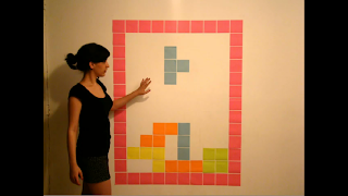
While looking at different clips of stop motion, I found a very interesting piece of work, which represents a Tetris Game. It was created using colour papers and a human in a quite big scale.
It is a 1 minute and 30 second simple video; however the outcome is very successful. The lighting was considered quite well as the shadow of the person doesn’t make the view unclear, but in my opinion, the whole video would look better if the lighting was actually stronger.
The camera stays in one position through the clip, but on the left hand side, the audience is able to see another object on the wall, what my distract from the main subject
I really like the idea of the animation, because it looks very realistic and the end of the clip becomes a little abstract where the objects start to interact with a human. Also, the sound was chosen well to make the animation more realistic.


Deadline Stop Motion Animation
Another interesting video is a 1 minute and 55 second clip, which represents the actions of a person by using coloured papers.
Comparing to the other stop motion animation, the lighting in this clip is considered a little bit better, as all the visible objects are very clear and there are no shadows. Also, there is a lot of movement going on not just by the human, but on the wall as well. This makes the piece of work very interesting, entertaining and colourful.
The camera angles change in some parts of the clip, so that everything is clear for the audience, but most of the time, we can see a person from the back sitting behind the desk, so that the whole video is easy to understand and everything is very clear.
Everything was considered and planned well. I think that the idea for the video is really interesting. As well as the video itself is very successful.


Angle

Camera Angles, like Distances, can be used by the Director to create meaning for the audience .
Conventionally High Angles , which look down on a subject are used t make the subject look small and vulnerable, while Low Angles, looking up at the subject make it big and important.

Establishing Shot shows the whole scene and introduces the audience to location or setting.
Cutaway is a shot which shows something other than the current action.
Insert Shot  shows some part of the subject detail.
Over the Shoulder Shot  looks over someone's shoulder at the subject. It can be used to position the audience closer to the action or to reveal some detail.
Two Shot is a shot with two people in it.
Three Shot is a shot with three people in it
Point-of-View Shot shows the audience a view of something from the subjects perspective.
Shot-Reverse-Shot is often used in scenes with a conversation. One speaker is shot, then the camera reversed to show the other speaker.

Distance

Distance is quite simply the distance between the camera and the subject being captured.


EWS (Extreme Wide Shot)
The view is so far from the subject that he isn't even visible. Often used as an establishing shot.

VWS (Very Wide Shot)
The subject is visible (barely), but the emphasis is still on placing him in his environment.

WS (Wide Shot)
The subject takes up the full frame, or at least as much as comfortably possible.

MS (Mid Shot)
Shows some part of the subject in more detail while still giving an impression of the whole subject.

MCU (Medium Close Up)
Half way between a MS and a CU.

CU (Close Up)

A certain feature or part of the subject takes up the whole frame


ECU (Extreme Close Up)
The ECU gets right in and shows extreme detail.

Cut-In
Shows some (other) part of the subject in detail.

Lighting

Lighting helps to convey the mood and atmosphere of the scene we are watching, The audience's attention can be focused or guided by brightly lighting an objects or person while keeping other objects or people in relative darkness.
Sometimes it may create tension and suspense by using shadows to mask or conceal elements.


Different types of lighting:
The Key Light is the brightest and the most influential. 
The Back Light helps to balance the effect of the Key Light making the character or object look more 'rounded'.
The Filler Light helps to soften harsh shadows that the Key Light and Back Light create. Usually may be more than one Filler Light.  

The Key Light can be directed from different angles to create different effects .
Underlighting is when the main source of lighting comes from below the subject. This tends to distort the character or object that is being lit, and is often used in Horror films. 
Top Lighting is when the main source of lighting comes from above, highlighting the features of a character. This technique is often used to create a glamorous look in a star. 
Back Lighting is when the light source is behind the subject. If little or no other lighting is used, silhouettes are created. 

Low-key & High-key Lighting 
Low-key lighting is created by using only by using the key and back lights. This creates a sharp contrast of light and dark areas on the screen. 
High-key Lighting means that more fillers are used. High-key lighting appears normal and realistic to our eyes. 

xBox Stop Motion Commercial

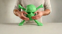
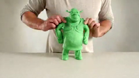
While experimenting with stop motion animation, I have looked at some videos. On YouTube, I found some very interesting and ambitious pieces. I particularly liked the Xbox stop motion commercial. It represents what you can do on Xbox concentrating on movies mainly.


In the commercial, the camera angle does not change; it is a medium close up and the camera stays at the same place through the whole video, showing a person’s hands and arms without showing the head. The character uses clay, which is green, because the logo of Xbox is in that colour.

The video is quite short, but there are a lot of things happening, because the video goes really quick. After 3 seconds, the person is already creating some characters from movies and it is really easy to recognise what is actually happening in the commercial. The reason why the camera stays at one place is to do not make the viewer confused about the whole clip. Also the minimum amount of objects is used so the message is clear.
I think that the commercial is pretty simple, but at the same time it’s very interesting and it gives a clear message.


http://www.youtube.com/watch?v=YNudcX_uUwM