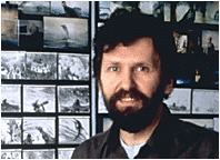
Ladyslaw Strarewicz

I have been researching for other inspiration to include it my final project. I looked at an animator, who was born in 1892 and he created animations like ‘The Beautiful Lukanida’ in 1910, ‘The Battle of the Stag Beetles’ also in 1910, then ‘The Ant and the Grasshopper’ in 1911, ‘Voyage to the Moon’, ‘On the Warsaw Highway’, ‘Frogland’ and many, many others. Starewicz was the first filmmaker to use stop frame animation and puppets to tell consistently understandable stories. His animations often included insects’ bodies what made the video more interesting. His works usually are about 7-15 minutes long and they have a certain story. The scenes are created to look realistically, however the characters are usually abstract. The colours of the projects are very simple, mainly because of the quality of the equipment Starewicz used to produce the stop motion animation, which wasn’t very good at that time. In his works, the abstract characters don’t speak. Instead, the animator put the piano music which will go with the clip to create mood and atmosphere and to make it easier to understand. 
I didn't find his work very helpful to produce our final project. The only part that might be a little but helpful is the way Starewicz used music to describe what is happening in the animation. 
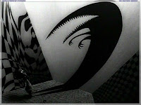

Tim Burton

I looked at different stop frane animation artists and I found Tim Burton as a very inspiring person, who is an American director and film producer. He is well known for creating animation like ‘The Nightmare Before Christmas’ and ‘Vincent’ where he used the stop frame animation through the whole video. However, he also produced movies like ‘Sleepy Hollow or ‘Charlie and the Chocolate Factory’, where he often worked with Johnny Depp. Burton’s style is usually very dark, dramatic, scary, where the shapes of the object are usually very exaggerated. I thought that looking at his stule might be helpful when producing our final project, because he created gothic style animation being influenced by art nouveau. However most of his film are either dark or colourful, but sometimes contain both including extremely dark atmosphere in buildings and set design.

 Vincent
In this stop frame animation Tim Burton created very dark, scary and exaggerated curved shapes with sharp edges. The use of black and white makes the animation even more successful . 


Alice in Wonderland
In Alice in Wonderland, Tim Burton shows a combination of dark colours and colourful background with the same Gothic style with many abstract shapes. Those factors make the film unique and interesting. 


The Nightmare Before Christmas
The style of this animation is very similar to 'Vincent' animation, because of the use of lines, shapes and shadows, however the use of the colours is more similar to 'Alice in Wonderland'.


I found Tim Burton's style very interesting, unique and influential , therefore I wanted to use a similar technique in our video. However, I wanted over final project to be more optimistic and positive, so I would rather use warmer colours. What I really liked about his work is the use of shapes and way he makes the lines curved to make the film successful. 

Alexander Petrov

I looked at the examples of artists’ work that used drawing, or painting techniques to create stop frame animation. One of the most interesting artists I found was Aleksander Petrov, who was a Russian animator and animation director. He mainly creates short video clips, which are entirely made in pastel oil paintings on glass, what is very impressive. Instead of a paintbrush, he used his fingertips on different glass sheets which he covered with slow drying oil paints, what gave him an ability to add depth into his work. Petrov usually painted on A2 canvas, so that every time he photographed the frame, he changed the image slightly for the next frame to create an illusion of movement when the photographs are running in a sequence. The technique Petrov uses a very creative, time consuming, beautiful and successful. His works include people, animals, landscapes which are painted very realistically. When making detailed paintings, the artist had to think of every movement very carefully. He also created different scenes and angles to make the video more realistic and so that the audience is able to easily understand what’s happening in the clip. I found work of Alexander Petrov very interesting and helpful as my project also inludes the creative part, where we had to create drawings when producing the stop frame.


The Process of a Final Idea

For our project development, we started creating out final video, by taking photographs. We created a studio, were we had much bigger space to work. By looking at our  first experiment, we thought that the idea of the newspapers worked well, so we decided to use them as a background again. For the lighting, we used a much bigger and more powerful source of light, so that the audience is focused on the character and so that all the details are visible.

I put few pictures of how we were creating the background. I also wanted to show the light, which we used for the project and how did the whole set looked overall. With the newspapers, we decided to go more spontaneous, what looks quite interesting, but in my opinion it also distracts the viewers' attention from the main subject.


Our final photographs weren't as successful as we expected, because even though, we considered the space of the set, the lighting etc. there were other things that didn't work. One of our ideas, was to draw on the body with henna, so that the actual drawings will be more visible and bold. Unfortunately, we had to stick with a pen at the end. 
We had limited time to take photographs, so to save time we used two people to draw on the body. This action gave two different styles of drawing at the end. Also, people creating the drawings produced shadows so when the video is played, the lighting keeps changing very quickly. 
Some photographs were taken out of focus, so again, this part didn't really work. 
When we start taking photographs for another video, we will use only one person to draw on the body, and we will make sure that the lighting is not distracted, so it keeps the same. 

The Process of a Final Idea

As our final idea, I came up with a new concept, which includes body drawing. I produced a very short clip of how I see the video. The purpose of the video would be to explore stop frame animation more in depth, by creating a video which will reflect the idea of it.
To create my experiment, I thought of the background firstly. Instead of having a plain one, I decided to use newspapers to make it more interesting without loosing the viewers' attention by placing the light on the right side and turning it directly towards the character.
On this video, I wanted to experiment with different objects, so that there is more than one subject. Another reason for placing a guitar in the set, is to show the difference between a subject where there is a movement and a subject which stays the same through the whole clip.
The set for the video is very simplified, as I was doing it at home, so there was limited space that I could use and I didn't have any strong and direct light. However, I think that as an experiment, the outcome is quite pleasing.


The Process of a Final Idea

By looking at all experiments we created, we decided that we're going to use a completely different technique from what we have used before. Firstly, we thought of using a human hand, which would be the character. However, as we were going along with the idea, we didn't like the outcome of it, so we started to think of another, different concept to create our stop frame animation.
Then I thought that we could use the body, instead of a hand and make it interesting and creative. We looked at different video clips which show body painting in a stop motion.

This video is a great example of something we want to create. It involves body painting, which actually runs very smoothly and it is a quite successful video. It represents a woman, who's face and top part of her body is painted in different colours, shapes etc. what relates to the title of the clip, 'Identity'. It could mean that she doesn't know what her identity is and she is searching for it. 
I personally think that this is a really incredible video. Everything seems to be considered really well and that includes lighting, background, colours and sound.


Another video, which is actually a music video called, 'Somebody That I Used To Know'. To create this clip, they used stop frame animation in some parts to make it more realistic. I really like how they colours are used and how art is combined together with human bodies. I was hugely inspired by this video and I wanted to use a similar style when producing our stop frame. 

Storyboard

Creating a storyboard while making a film or a video is very important. They can be produced by hand drawing or digitally on the computer. This process helps organise the sequence of the clip. It was firstly developed by the Walt Disney Studio and even nowadays some film makers use this technique to get a better understanding of a certain scene.
Josh Sheppard created a site which shows his storyboard work in Feature Films and TV.
http://www.thestoryboardartist.com/Site/Home.html

His works are very interesting and creative. Images in his storyboards are mainly hand drawn which include a lot of details, they show perspective, describe what is going on in the scene and also he tells us the names of the characters. He carefully considers lighting and the camera angles and movements. These things make the storyboard very clear and easy to understand.

Another artist who creates storyboards is Ian McCaughrean. He produces most of his images digitally. They are very detailed, clear and organised illustrations, which are easily give the message.

Examples of storyboards:


2D Experimentation

As one of our first project, we created something very simple using a white board and a pen. 
The video represents a basketball game. The clip is only 3 seconds long, as it was an experiment to see how it is going to work. We found it quite interesting, but at the same time challenging to draw the same subject every time in a certain form and shape. I think, we should have made more photographs, so that the video would run smoothly and it would be longer. 

We created another very simple video, which represents a snake. Again, its a quite short video, because it only lasts for about 9 seconds, but in my opinion it is more successful than the first one, as the drawings were easier. 

In both videos, we didn't consider the lighting, so it is different on every single photograph. 

Snowmen Experiment


This is one of our first stop frame experiments. We used Jan Švankmajer's technique to create it, however we didn't want to use his style, because its too controversial, so we decided to turn our video into something more entertaining. We presented snowmen which were produced out of clay, just like most of the objects in Jan Švankmajer's videos. We mainly concentrated on the facial expression to that the video will be easier to understand. Overall, the idea is quite interesting, even though its simple. However, there is a lot of techniqal things we would have to improve to produce a successful video. One of them is the background. When we were taking the photographs, we took the from the wrong angle, so that unwanted objects appeared on the images. Another thing is the movement, it was quite difficult to control the movement of the snowball in the air and on some photographs, the audience can see a hand holding a hair which is attached to the clay snowball. Also, doesn't run smoothly. That's again because of the control of the movement. We never considered the lighting when producing the project and we used a sunlight, what caused changes of the amount of light.